At some point, somebody in Japan looked at a dish of food and decided that what it really needed was less food. Not smaller portions, necessarily. Just… restraint. A little breathing room.
This is moritsuke - the Japanese art of food presentation - where the empty part of the plate is often working just as hard as the occupied part. Diners encountering it for the first time sometimes react with alarm, as though the kitchen forgot to finish plating. It did not. That untouched stretch is part of the attention to detail characteristic of Japanese culture; it radiates calm and centuries of aesthetic philosophy while, on the other side of the world, mashed potatoes spread across the plate like a power-crazed empire.
Moritsuke isn't a secret code. Once you understand what it's doing, you'll see it everywhere: in every kaiseki meal, every sushi platter and every teishoku set meal that appears before you on a tray. And you may ask yourself: is it time for the mashed-potato empire to end?
Food Arrangement in Japanese Cuisine
The core plating principles of moritsuke are three and they work together.

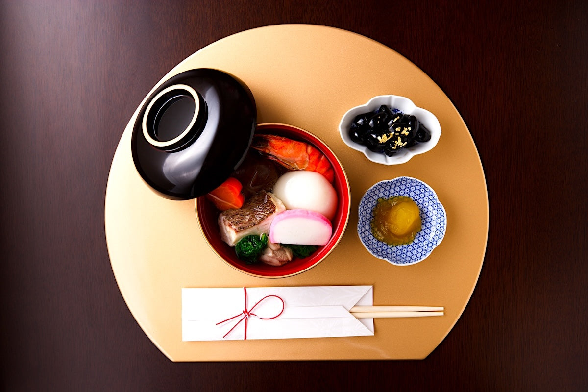
The first is height. Japanese plating avoids flat arrangements - food laid out across the plate like a topographical map of the Netherlands. Instead, dishes are built upward. For simmered vegetables, the food is peaked at the center. For sashimi, daikon shreds are piled first as a base and the fish slices leaned against them. Tempura is arranged low at the front and higher toward the back, echoing a typical Japanese landscape: mountains behind, the plains or the sea in front.
Sugimori (杉盛り), the single-item version of this arrangement, takes its name and form from a sugi, or Japanese cedar. Commonly used for salads, vinegared dishes and other foods served in small bowls, the ingredients are piled up in a neat cone, creating both height and visual balance.
The second principle is asymmetry - almost every aspect of Japanese aesthetics prefers this over symmetry. In plating, it translates into an arrangement weighted to one side. Multiple items are arranged in odd numbers - one, three, five, seven - which are traditionally considered auspicious.
The third principle is the one that most surprises people encountering Japanese aesthetics in food for the first time: the empty space. The Japanese term 'ma' (間) refers to a productive pause, a meaningful gap and, when applied to food on the plate, it means that roughly 70% of the surface is covered while 30% remains deliberately bare.
The visual appeal of the food depends on what surrounds it: the vessel's color, pattern and texture. Negative space focuses the eye on these. The ratio shifts slightly by season - more white space in summer for an airy, refreshing feel; slightly less in winter, where a fuller vessel incorporates a sense of warmth.
Colors Used in Japanese Cooking

Japanese food presentation rests on goshoku, or the five colors: red, yellow, green (sometimes rendered as blue), white and black. The framework comes from Chinese yin-yang cosmology and was adapted into Japanese culinary practice alongside the five tastes (sweet, salty, sour, bitter and umami) and the five methods of food preparation: raw, simmering, grilling, steaming and deep-frying.
Red and yellow - salmon roe, tuna or tamagoyaki omelette - stimulate the appetite, while green brings freshness and calmness. White, usually present as rice or tofu, creates a sense of cleanliness. Nori, hijiki seaweed and black sesame seeds are classic ways to add black; the color provides depth and contrast, the visual equivalent of a bass note that keeps the composition from floating away.
Rather than trying to cram all five colors into every dish, the goal is to create a sense of balance across the spread of a meal. The color of the miso soup counts. The pickles count. So does a small dish of soya sauce.
The five colors are also subject to a rule of proportion: vivid hues should appear in small quantities, pale ones in larger amounts. Let a bright red dominate a pale dish and the result feels aggressive rather than appetizing.
Garnishing with the Season
Seasonality sits at the center of Japanese food culture and moritsuke is one of the primary ways in which it's expressed. Ingredients that evoke the season matter, of course, but garnishes and vessels also do much heavy lifting to place a dish in a specific moment of the year.
The garnish on top of the dish - tenmori (天盛り), the crowning touch - is almost always seasonal. Salted sakura flowers add a touch of spring to the arrangement; kinome, the young sansho leaves that emerge at the same time, brings a fragrance that is essentially the scent of the season.
Ingredients such as green shiso, sudachi citrus and junsai water shield offer a feeling of freshness in summer through their vivid colors, crisp aromas and associations with flowing water.
In autumn, a sprinkling of edible chrysanthemum petals may appear as a garnish and, in winter, yuzu peel, sometimes cut to resemble pine needles, takes the tenmori spot.
Beneath the food, a kaishiki - a liner of natural leaves or decorative paper - adds another layer of seasonal suggestion. The motifs and materials might unfold like this: plum blossoms in early spring, bamboo leaves in summer, persimmon and maple in autumn, pine needles and nandina berries in winter.
The Kimono of the Dish
Just as a kimono is chosen to suit the occasion, the season and the person wearing it, the tableware is chosen to suit the food, the season and the context.
When used in spring, celadon and other styles of porcelain as well as softly colored vessels emphasize the freshness and lightness of the season.

Summer dishes often appear in glass bowls or containers fashioned from fresh green bamboo, materials chosen for their ability to suggest coolness even before the first bite is taken.
Autumn, by contrast, celebrates abundance and the changing landscape. Maple and ginkgo leaves serve as seasonal decorations, while ginkgo nuts, chestnuts and maple leaf-shaped wheat gluten known as momiji-fu echo the colors and harvests of the season. The tableware changes as well. Ceramics in warm browns, reds and amber tones mirror the hues of autumn foliage, lending a sense of richness to the meal.
Winter presentation shifts toward comfort and warmth. Heavier vessels with substantial forms are favored, their weight and texture creating a feeling of shelter against the cold.
Earthenware pottery - with its slightly rough texture and warm tones - holds heat and conveys rusticity and comfort, making it well-suited to the simmered and steamed dishes of autumn and winter.
Lacquer - especially black lacquer - brings depth and formality to any table regardless of season. A New Year's spread will almost certainly include lacquerware, together with gold or silver elements.
The principle of contrast runs through all of it: colorful food on a subdued vessel; simple food on a more decorative one.
Learning to See Before You Plate
In traditional Japanese fine dining, apprentices learn by watching. They watch the head chef. They watch their seniors. They watch - and they practice until the correct angle, the correct height, the correct placement of the garnish is in their hands and in their gut rather than only in their heads.
The implication is that moritsuke is a physical skill as much as a visual judgment. You build the muscle memory through repetition - the way a chef builds trains the palate through tasting - until the eye and the hand stop consulting each other nervously.
For a home cook, the process is more forgiving but the sequence is the same: observe first, then practice one principle at a time. A useful starting point is to transfer cooked food - a simmered dish from a deli, perhaps - from its packaging to a proper vessel and apply the 70/30 rule: 70% covered, 30% white space.
Then think about height.
Then decorate the plate with a single garnish.
When the plate changes, the dining experience changes.
Visually Pleasing Dishes at Home
The reassuring part is that moritsuke does not require a Kyoto kaiseki apprenticeship or a pottery collection worth the price of a small apartment.
The principles that Japanese chefs regularly use will work even at home. A little height. A little asymmetry. A little empty space. With all this in mind, transfer convenience-store sushi onto a vessel that reflects the season and, suddenly, you're transported to a sushi counter in Tokyo.